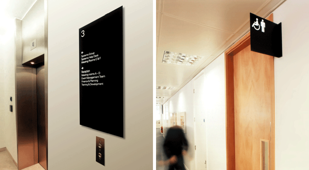
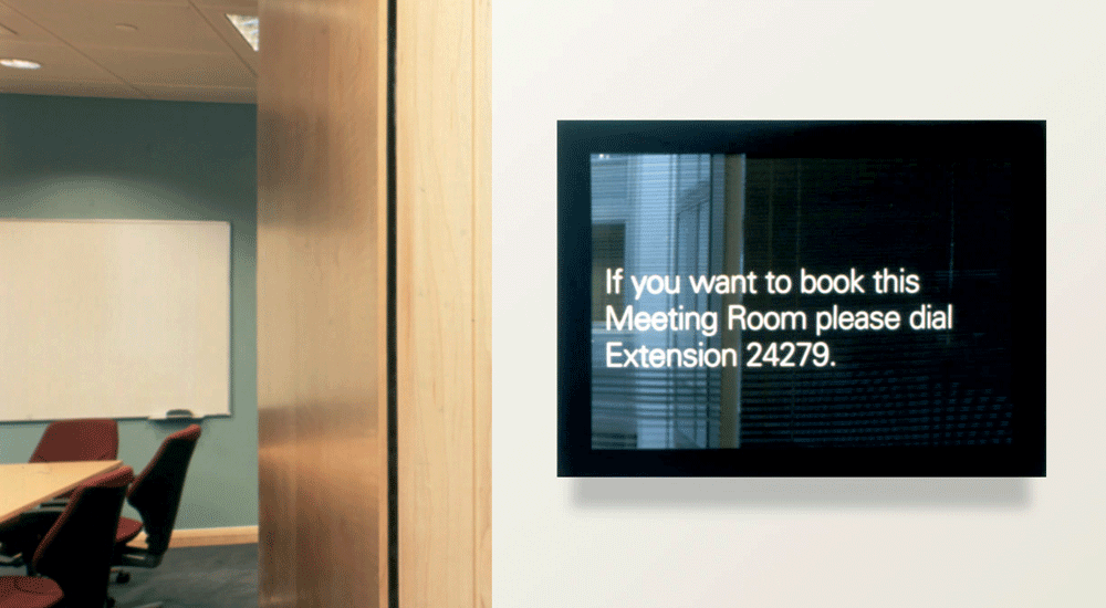
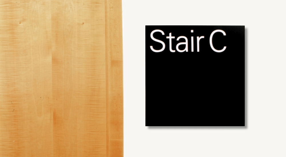
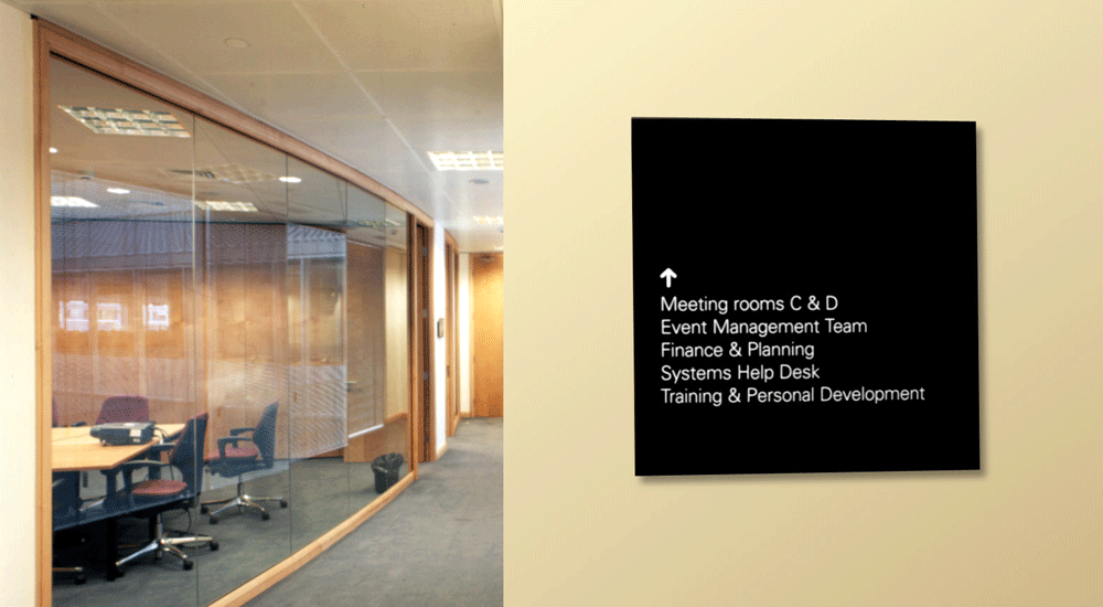
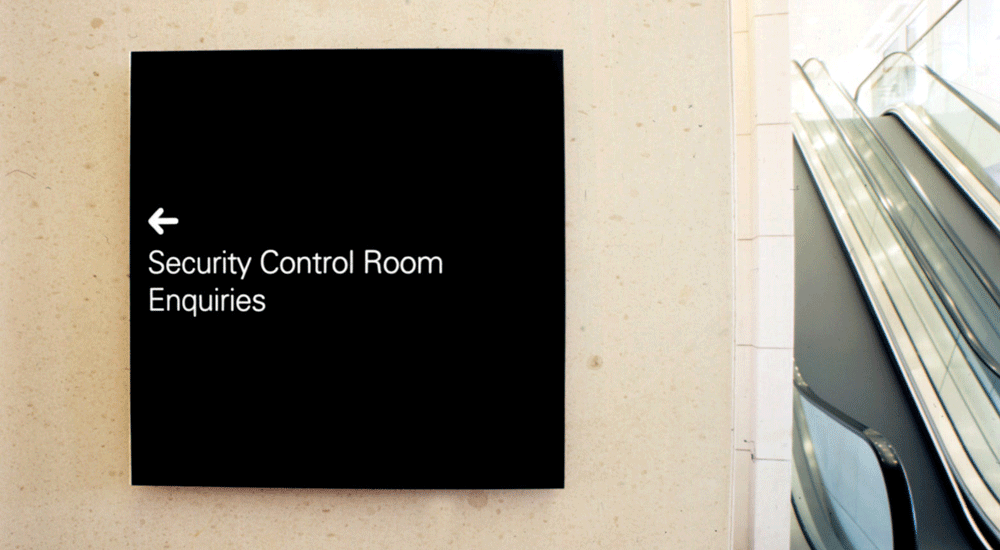
The brief for this project was clarity, simplicity and versatility. The signage system was based on simple flat panels floating away from the walls. This gave complete freedom of typographic layout, and a visual aesthetic that worked across the various architectural styles that comprise their London offices.
My role centred on the design of the system in conjunction with the graphic development, devising the wayfinding strategy , conducting the surveys and scheduling.
Lead Designer: CDT Design
Manufacturer: Wood & Wood Signs

